

Advances in information and communication technologies have created a surge of interest in data literacy visualization courses for their potential to help students critically interrogate, design and communicate complex information effectively (Osterman, 2013). This rise in data literacy has also been influenced by the increasing availability of data visualization tools (Lankow, et al., 2012). For some time, news organizations have been at the forefront of compelling storytelling using data visualizations that help direct an audience to key details in news reports by eliminating clutter (Knaflic, 2015). Research also shows students who are visual learners process and retain information more effectively when they can see material in graphic forms (Felder & Solomon, 2000). These findings have further accelerated questions within higher education about the pedagogical benefits data visualizations can contribute to advancing digital literacy while also promoting competency-based education programs. This article examines lessons learned from teaching the Pathways II Seminar 1099 course “Now You See
It – Digital Competencies and Visual Literacies” which is designed to help students understand visual culture through the acquisition of cognitive skills and critical vocabulary in order to critique and design data visuals that often reveal new discoveries and experiences about a world saturated in data.
Teaching Case Study
Now in its second semester, the Seminar 1099 course “Now You See It”, tasks 20 students, who are predominantly science and engineering majors, with assignments ranging from (1) critical reading responses about infographics and data visualizations; (2) rhetorical analysis of contrasting visuals; (3) story-mapping using infographics and data visuals; and (4) critical examinations of misleading data visuals. These assignments were designed with guidance and assessment criteria developed by Denison University President, Adam Weinberg, whose article “Data Analytics and the Liberal Arts” (2016), recommends four critical criteria for the creation of data visualization courses:
- Framing Questions: Too often, we get the right answer to the wrong question. The ability to frame questions is probably the most important role of a liberal arts background in learning to use big data effectively. If we get the question wrong, the answer is irrelevant.
- Working in Teams: Both the framing of questions and data analysis often will require working in
interdisciplinary teams, comprising people who see the world differently. Data analytics will need people who can harness the inherent strength of teams with diverse backgrounds. - Communicating Results: Findings need to be communicated well. In other words, technically
sophisticated results need to be communicated to top executives in ways that they can understand and make use of in order to reach informed decisions based on facts. - Ethical Decision-making: In today’s world, we have access to data that we may or may not want to
use. These lines are just starting to come into focus. For data analytics to drive us forward, we need a generation of people shaping the field who see, acknowledge, and grapple with ethical concerns,
especially as they relate to issues of privacy and civil liberties. (AAC&U Weekly Liberal Arts News
Watch, 2016).
Weinberg’s recommendations are further supported by a rationale for data visualization education design using a “soft systems methodology” (Checkland, 2000), which claims:
. . . complexity of human affairs is always a complexity of multiple interacting relationships; and pictures are a better medium than linear prose for expressing relationships. Pictures can be taken in as a whole and help to encourage holistic rather than reductionist thinking about a situation (Checkland, 2000, p. 12).
Based on these pedagogical frameworks and two semesters experienced with teaching the course, the following insights have emerged to foster and improve digital and visual literacy instruction:
- Since course design involves trial and error, placing students in teams to examine and design infographics and data visuals have proven most effective.
- Since data visualization can provide students with the ability to comprehend huge amounts of data, it is important to design assignments with measurable learning outcomes.
- Since a variety of tools exist to create infographics and data visualizations, time must be invested in examining these tools, which can be strategically linked with assignment designs. Consultations with CLT Instructional Technologists have proven most beneficial in this area.
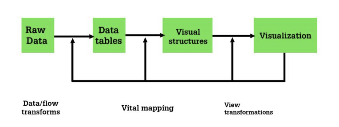
- Since data visualization requires that the data itself is accurate to achieve “fidelity” in storytelling, students must learn how to critically interrogate datasets that are misleading. This is an important skill set because it allows students to understand the social, political and economic factors, which shape how data is collected. (See Figure 1 below).
A formative assessment of the Seminar 1099 course is planned for the spring 2017 semester. The formative assessment will encourage more evaluative needs for students and incorporate current trends and technologies for the creation of a critical curriculum design. Such an assessment will also allow for an examination of how the course encourages the development of cognitive processes in students and academic rationalism that helps them choose courses that are worthy of study. Based on current in-class discussions and written reflections about the course, overall consensus from students has been positive. In many cases, students have commented that learning to interrogate, interpret, and design with complex data, is enabling them to communicate with greater efficiency. Furthermore, as employers demand more competency-based skills from college graduates, institutions of higher learning are tasked with designing courses to leverage employer needs. Infographics and data visual communication
courses represent a new approach to curriculum design with learning outcomes created to help students identify ambiguity, indecisiveness, and misleading information in a world that is engulfed with data.
References
Checkland, P. (2000). Soft systems methodology: a thirty year retrospective. Systems Research and Behavioral Science, 17, pp. S11-S58. Retrieved from http://eu.wiley.com/WileyCDA/WileyTitle/productCd-SRBS.html
Felder, R. M., & Soloman, B. A. (2000). Learning styles and strategies. Retrieved from
http://www4.ncsu.edu/unity/lockers/users/f/felder/public/ILSdir/styles.html
Knaflic, C.N. (2015). Storytelling with data: A data visualization guide for business professionals. Hoboken: Wiley.
Lankow, J., Ritchie, J., & Crooks, R. (2012). Infographics: The power of visual storytelling. Wiley.
Osterman, M., Reio Jr, T. G., & Thirunarayanan, M. (2013). Digital literacy: A demand for nonlinear thinking styles. Florida International University Digital Commons. Retrieved from
http://digitalcommons.fiu.edu/cgi/viewcontent.cgi?article=1321&context=sferc
Weinberg, A. (2016). Data analytics and the liberal arts. Association of American Colleges and Universities. (AAC&U).
Washington, D.C. Retrieved from https://www.aacu.org/liberal-education-news-watch